

Romantic English
The Linotype Printer’s Complete Manual of Beautiful Typography Classic Type Composition, Page Design, Letterspacing, Proportion and Printing Principles from the Rare 1923 Mergenthaler Linotype Handbook
The Linotype Printer’s Complete Manual of Beautiful Typography Classic Type Composition, Page Design, Letterspacing, Proportion and Printing Principles from the Rare 1923 Mergenthaler Linotype Handbook
Couldn't load pickup availability
The Linotype Printer’s Complete Manual of Beautiful Typography
Classic Type Composition, Page Design, Letterspacing, Proportion and Printing Principles from the Rare 1923 Mergenthaler Linotype Handbook
By the Mergenthaler Linotype Company
Romantic English Archive Edition
Before Typography Became a Menu, It Was a Discipline
Today, one may select a typeface with a click, enlarge it with a gesture and declare the page “finished” before the kettle has boiled.
The result is often perfectly legible.
It is not always beautiful.
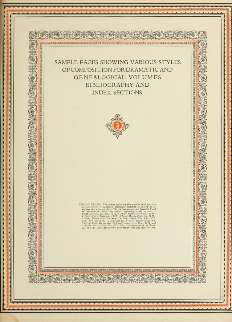
In 1923, the Mergenthaler Linotype Company published The Manual of Linotype Typography for readers who understood that a printed page was not merely a container for words. It was a composition.
Type had weight.
Spacing had rhythm.
Margins created atmosphere.
Headings established order.
Every line, rule, ornament and blank space participated in the final impression.
This remarkable handbook was prepared to help printers, publishers, advertisers and designers achieve what its original title described with admirable confidence:
Greater unity and real beauty in the printed page.
Now presented as a Romantic English Archive Edition, this historic manual offers modern designers a direct education in the principles that made early twentieth-century printing so distinctive, orderly and enduring.
It is not merely a book about machinery.
It is a book about judgment.
And judgment, unlike software, rarely arrives with an update.
A Working Education in the Art of the Printed Page
The great strength of this handbook lies in its practicality.
It does not discuss typography as a vague matter of taste. It demonstrates how a page should be organised, how typefaces should relate to one another and how proportion can turn an ordinary arrangement of words into something harmonious.
Within these pages, you will encounter guidance and visual examples relating to:
-
Type composition
-
Page proportion
-
Headline hierarchy
-
Display typography
-
Body-text arrangement
-
Letterspacing and word spacing
-
Line length and leading
-
Margins and white space
-
Rules, borders and ornaments
-
Advertising layouts
-
Book and periodical design
-
Printing-house standards
-
Decorative type treatments
-
Unity across the entire page
These are not antiquated concerns.
They are the very questions confronting every contemporary designer, publisher, author and marketer who opens a blank document and wonders why the result does not yet look convincing.
What the Linotype Era Understood
The Linotype machine transformed printing by allowing an operator to compose entire lines of type quickly and efficiently.
But speed alone did not guarantee beauty.
The machine could produce words.
The designer still had to produce order.
That distinction sits at the heart of this manual.
A powerful tool is only as refined as the eye directing it.
The same remains true today.
A modern computer can offer ten thousand typefaces, endless templates and effects of almost heroic enthusiasm. Yet abundance can make good judgment harder, not easier.
This book returns the reader to the essentials:
How much is enough?
Where should the eye begin?
How should one line relate to the next?
Which typefaces belong together?
When should ornament be used?
When should it be left quietly in the drawer?
The manual teaches not only what to add, but what to resist.
That alone makes it unusually modern.
For Graphic Designers Who Want Their Work to Look Designed
There is a meaningful difference between placing text on a page and designing with type.
This handbook helps make that difference visible.
It encourages designers to consider the page as a whole rather than as a collection of separate decisions. A headline should not merely be large. It should establish a relationship with the text beneath it.
A border should not merely decorate. It should contain and organise.
White space should not be treated as an empty area awaiting rescue. It should be used deliberately.
The principles within this volume can inform:
-
Posters
-
Editorial layouts
-
Book interiors
-
Brochures
-
Brand guidelines
-
Advertisements
-
Packaging
-
Catalogues
-
Invitations
-
Menus
-
Newspapers and newsletters
-
Website typography
-
Social-media graphics
-
Presentation design
The technology may have changed.
The eye has not.
For Independent Publishers and Authors
Many books are written with care and then dressed for publication in great haste.
This is unfortunate.
A book’s typography is part of its voice.
The width of the text block affects the pace of reading.
The spacing around a chapter title establishes tone.
The relationship between headings and body text creates authority—or destroys it.
For authors and independent publishers, this manual offers invaluable inspiration for:
-
Title-page design
-
Chapter openings
-
Contents pages
-
Running heads
-
Page-number placement
-
Paragraph treatment
-
Decorative initials
-
Section divisions
-
Footnotes and captions
-
Classic book proportions
A beautifully typeset book does not announce its decisions loudly.
It simply feels correct.
The reader may not identify why the page is comfortable, elegant or trustworthy.
But the reader feels it nevertheless.
That is typography doing its work properly.
For Brand Designers and Advertising Professionals
The Mergenthaler Linotype Company understood that commercial printing had to do more than convey information.
It had to attract attention.
Establish confidence.
Create hierarchy.
Lead the reader toward an action.
This makes the handbook especially valuable for anyone working in branding or advertising.
Its examples can inspire:
-
Heritage brand identities
-
Editorial advertisements
-
Product labels
-
Luxury packaging
-
Restaurant menus
-
Hotel stationery
-
Historic-style campaigns
-
Vintage posters
-
Typographic logos
-
Retail signage
-
Direct-mail pieces
-
Print-inspired social content
The strongest advertising layouts do not ask every element to shout.
They decide what matters most and make that message impossible to miss.
A bold headline draws the eye.
Supporting type builds interest.
Spacing creates clarity.
The offer appears at the correct moment.
The call to action is unmistakable.
Good typography is not cosmetic.
It is persuasion made visible.
For Letterpress Printers and Traditional Craftspeople
Those who work with physical type understand something the digital world easily forgets:
Every letter occupies space.
Every line has weight.
Every adjustment has consequence.
This book will feel immediately familiar to letterpress printers, bookbinders, printmakers and typographic craftspeople because it was created within a world where design decisions were physical.
Type had to be chosen, set and locked into place.
Spacing required material.
Errors required correction by hand.
Because each decision carried a cost, each decision demanded thought.
The manual preserves that discipline.
For practitioners of traditional printing, it offers both historical context and practical inspiration. For digital designers, it offers something equally valuable: a glimpse of what typography looks like when care cannot be hidden behind an undo button.
For Students of Graphic Design and Printing History
A great many design students are taught software before they are taught proportion.
They learn how to make text larger before learning why it should be larger.
They learn effects before hierarchy.
They learn speed before restraint.
This manual provides a useful corrective.
It can help students study:
-
The history of mechanical typesetting
-
Early twentieth-century print culture
-
Classical page construction
-
Typographic hierarchy
-
Commercial composition
-
Display-type conventions
-
The relationship between technology and design
-
Historical advertising layouts
-
Printing standards and craft terminology
The book reveals how industrial printing and artistic judgment developed together.
It is a record of technology, certainly.
But more importantly, it is a record of professional standards.
A Guide to Unity—The Quality Most Pages Lack
The original purpose of the manual was to help secure greater unity in the printed page.
Unity is an unfashionable word, but a useful one.
It means that every part belongs.
The headline, body text, border, ornament, illustration and margin should appear to have been designed by the same intelligence for the same purpose.
Without unity, a page feels assembled.
With unity, it feels inevitable.
The manual demonstrates how this effect is created through consistency in:
-
Typeface selection
-
Alignment
-
Spacing
-
Repetition
-
Scale
-
Proportion
-
Ornament
-
Visual rhythm
A unified page is easier to read and easier to trust.
It also possesses that rare quality modern templates so often promise and so rarely deliver:
Character without confusion.
White Space Is Not Wasted Space
One of typography’s enduring mysteries is the suspicion that an empty area must be filled.
Perhaps with another ornament.
Perhaps with a decorative line.
Perhaps with an inspiring quotation in italics.
The wiser designer resists.
White space gives content room to exist.
It separates ideas.
It establishes emphasis.
It makes a page feel considered rather than crowded.
The examples and principles in this handbook encourage the reader to view space as an active design element.
This is particularly valuable today, when screens and advertisements compete to fill every available inch with something urgent.
A quiet margin can possess more authority than a dozen effects.
The book reminds us that elegance often begins where the designer chooses to stop.
The Art of Choosing Typefaces That Do Not Quarrel
Typography is social.
Some typefaces belong together.
Others should be introduced only under careful supervision.
This manual helps the reader understand contrast and compatibility.
A display face may provide character, while a quieter text face carries the reading.
Different weights establish hierarchy.
Changes in size create emphasis.
But variety must be controlled.
The goal is not to demonstrate how many fonts one owns.
The goal is to guide the reader.
This principle is useful for virtually every design project, from an elaborate printed catalogue to a single Pinterest graphic.
Choose with purpose.
Repeat consistently.
Contrast clearly.
And avoid allowing six unrelated typefaces to behave as though they have all been promised the leading role.
A Rare Glimpse Inside the Professional Printing World of 1923
This volume also offers something beyond technical instruction.
It opens a window into the printing trade at a pivotal moment.
Mechanical composition had changed how quickly and efficiently printed material could be produced. Newspapers, books, advertisements and periodicals were reaching enormous audiences.
The need for strong standards had never been greater.
The Mergenthaler Linotype Company did not merely sell machinery. It promoted an ideal of professional printing in which efficiency and beauty could coexist.
The handbook reflects that ambition.
Its pages communicate confidence in the printed word and respect for the craft behind it.
For historians, collectors and lovers of vintage print culture, the manual is an absorbing document of an age when typography helped define public life.
A Digital Edition Made for Modern Use
An original copy of the 1923 manual is a desirable historical object.
It is also far too easy to damage, misplace or accidentally decorate with coffee.
The ebook edition allows you to consult the material freely.
Open it beside your design software.
Browse it while planning a publication.
Study its layouts on a tablet.
Zoom into details.
Return to it whenever your typography begins to feel uncertain, crowded or painfully contemporary.
The digital format turns a rare historical handbook into a practical studio reference.
No special handling.
No appointment.
No stern archivist.
Only page after page of typographic intelligence ready when you need it.
Why This Book Belongs in the Romantic English Library
Romantic English is devoted to recovering books that still have something useful, beautiful and occasionally rather stern to say to the present.
The Manual of Linotype Typography belongs naturally among them.
It represents a world in which craft mattered.
A world in which commercial work could be handsome.
A world in which printers did not regard beauty as an optional flourish but as part of professional competence.
This edition invites a new generation to rediscover those values.
Not to reproduce 1923 blindly.
Not to abandon modern tools.
But to bring better judgment to the tools we have.
For Anyone Who Believes Words Deserve Better Clothing
Typography is the clothing of language.
Poor typography may leave good writing looking uncertain.
Excellent typography gives it presence.
A well-designed page can make an argument clearer, a story more inviting and a product more desirable.
It can turn information into communication.
It can turn printing into publishing.
It can turn a collection of words into an object one wishes to keep.
That is the promise of this manual.
Not a shortcut.
Not a collection of fashionable effects.
A foundation.
What You Will Gain from This Historic Manual
By exploring this ebook, you will develop a sharper eye for:
-
Why some pages feel balanced and others do not
-
How hierarchy guides attention
-
How spacing affects readability
-
Why margins matter
-
How ornaments support a layout
-
How display type creates character
-
How consistency produces authority
-
How restraint creates elegance
-
How typography influences persuasion
-
How traditional principles strengthen modern design
The more carefully you examine these pages, the more difficult it becomes to accept careless typography elsewhere.
This may be inconvenient.
It is also the beginning of taste.
Your Next Page Can Be Better
You could continue relying upon default settings.
You could centre the headline, enlarge it until it appears important and hope the rest arranges itself.
Or you could learn from a company that helped shape the history of modern printing.
The Linotype Printer’s Complete Manual of Beautiful Typography places the design wisdom of the Mergenthaler Linotype Company directly into your digital library.
Use it to refine your pages.
Strengthen your advertisements.
Improve your books.
Develop your eye.
And recover the confidence of an era that believed the printed page should not merely work.
It should look magnificent while doing so.
Add This Rare 1923 Typography Manual to Your Library Today
The principles inside this book have outlived the machines for which they were originally written.
That is how one recognises genuine design wisdom.
Technology changes.
Beauty remains surprisingly stubborn.
Open the manual. Study the examples. See your own work differently.
Click now to add The Linotype Printer’s Complete Manual of Beautiful Typography to your Romantic English digital library.
Bring greater unity to your layouts.
Bring greater discipline to your typography.
Bring real beauty back to the printed page.
Your words have already done their part. Now give them a page worthy of them.
Share